Client project · Web SaaS
Enclave
Digital Platform UI/UX Design
Live website — coming soon
Overview
A UI/UX design project focused on creating a clean, modern and intuitive digital platform. I designed the interface in Figma, working on user flows, responsive layouts, navigation and reusable components.
My approach
I wanted Enclave to feel calm and orderly, even with many products, organizations and license requests to manage. I kept the interface neutral, let status labels carry the meaning, and kept the most frequent actions close at hand.
Challenge / Goal
The goal was to organize the platform so people can find what they need quickly on any screen size with navigation that stays predictable and components that look and behave the same across every page.
Structure
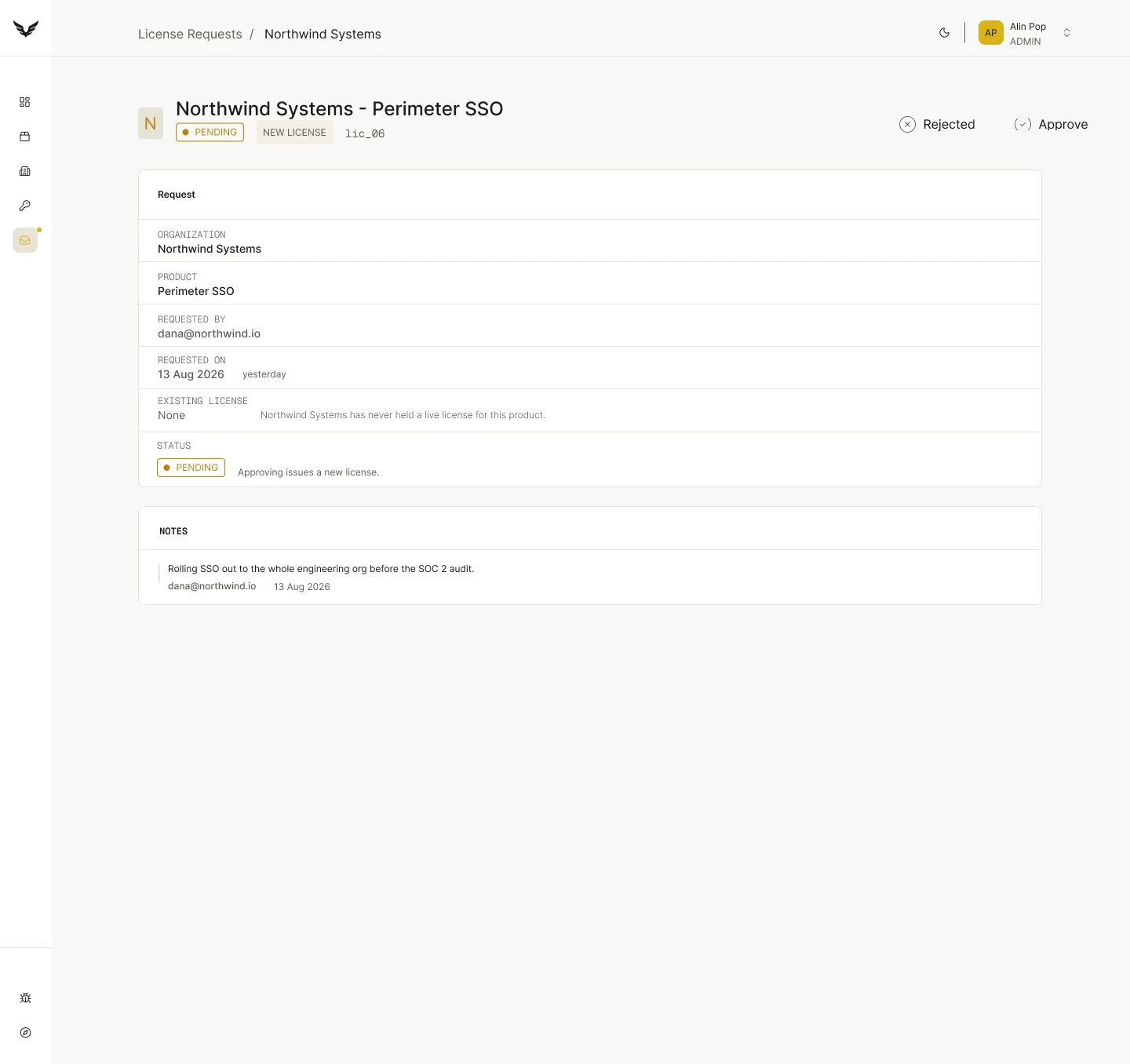
The work was organized in four layers, each building on the previous one: from the paths people take, to the components that make every screen consistent. Below, the most frequent path: handling a license request.
User flows
Mapping the main paths through the platform before designing any screens.
Navigation
A consistent navigation pattern that works on desktop and adapts on smaller screens.
Layouts
A shared grid and spacing system used across all pages and breakpoints.
Components
Reusable components built with Auto Layout and variants.
Key Screens
The main screens of the platform, designed on a shared grid with consistent navigation and reusable components.
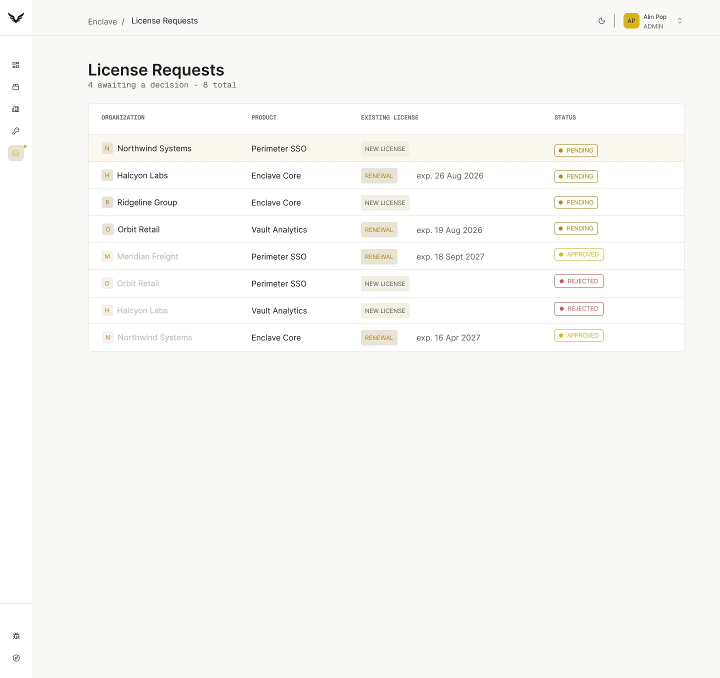
01License Requests
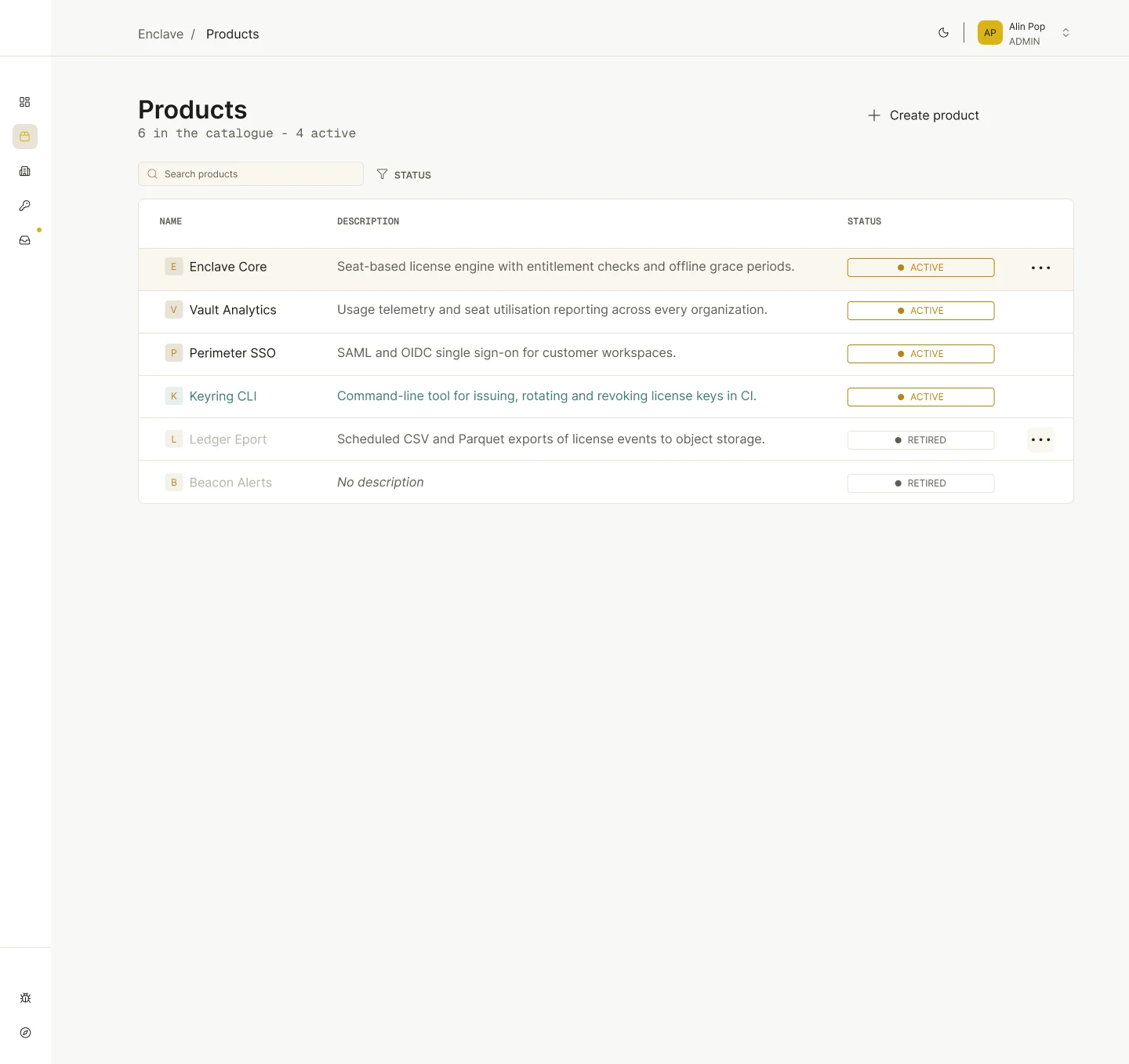
02Products
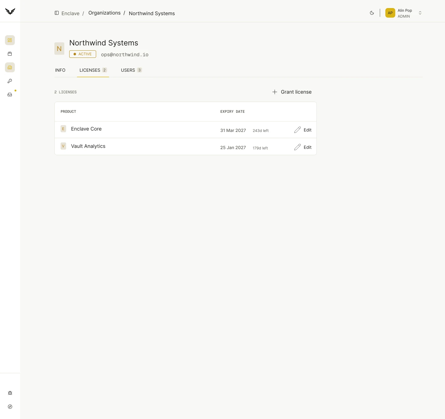
03Organization
Responsive Design
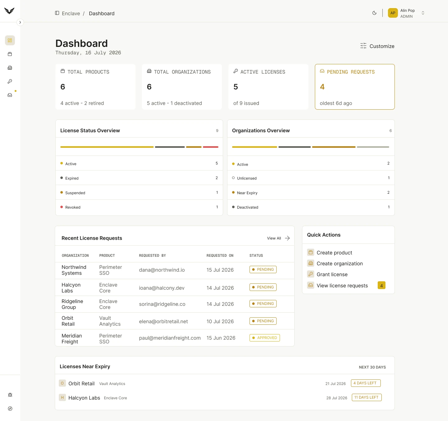
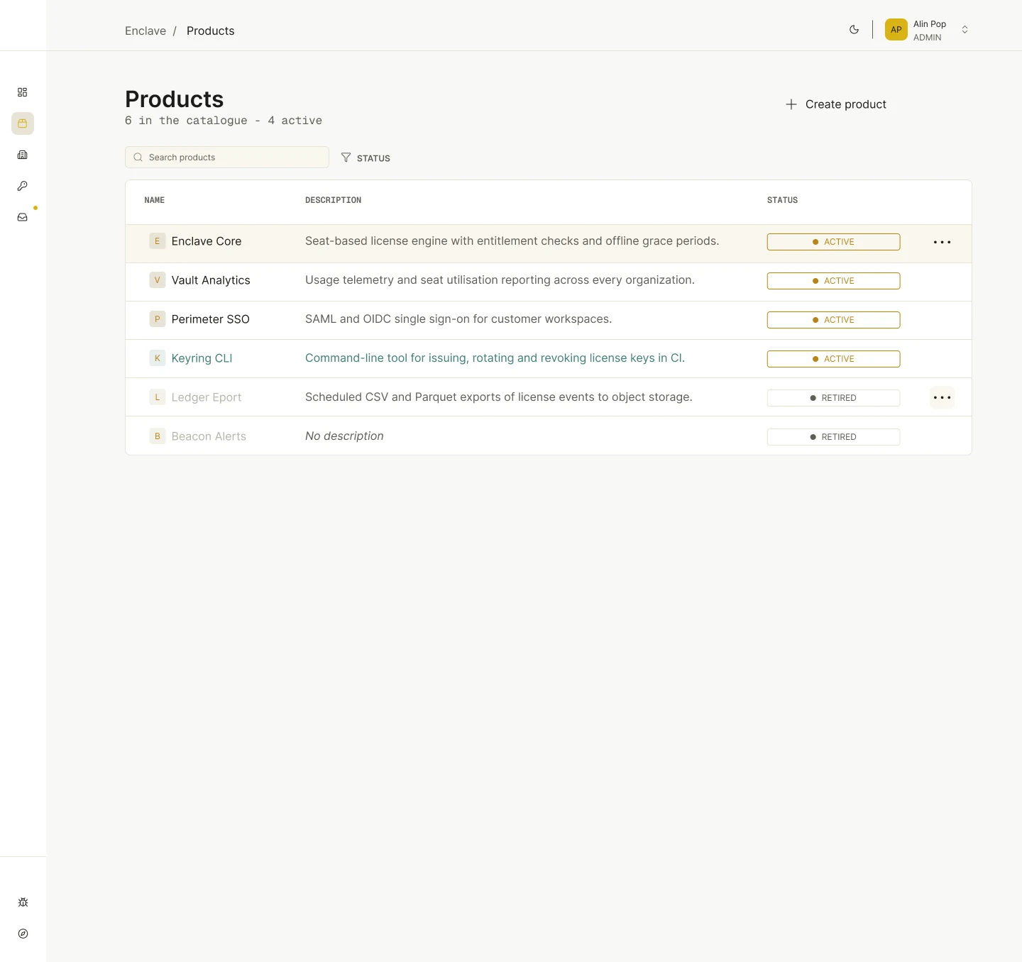
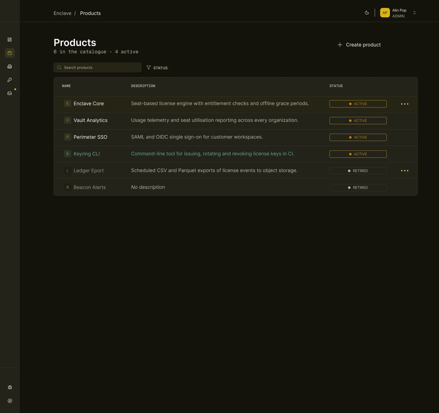
The layout adapts to the space available: the sidebar navigation collapses into a compact icon rail, giving tables and dashboards more room while the content hierarchy stays the same.
Dark mode & interactions
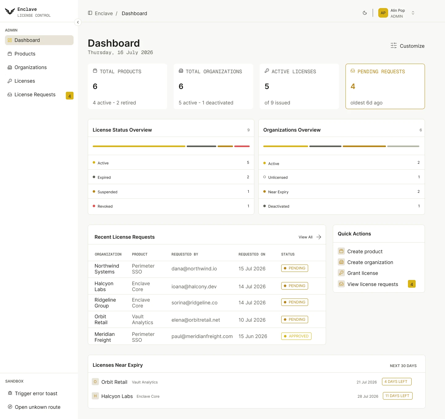
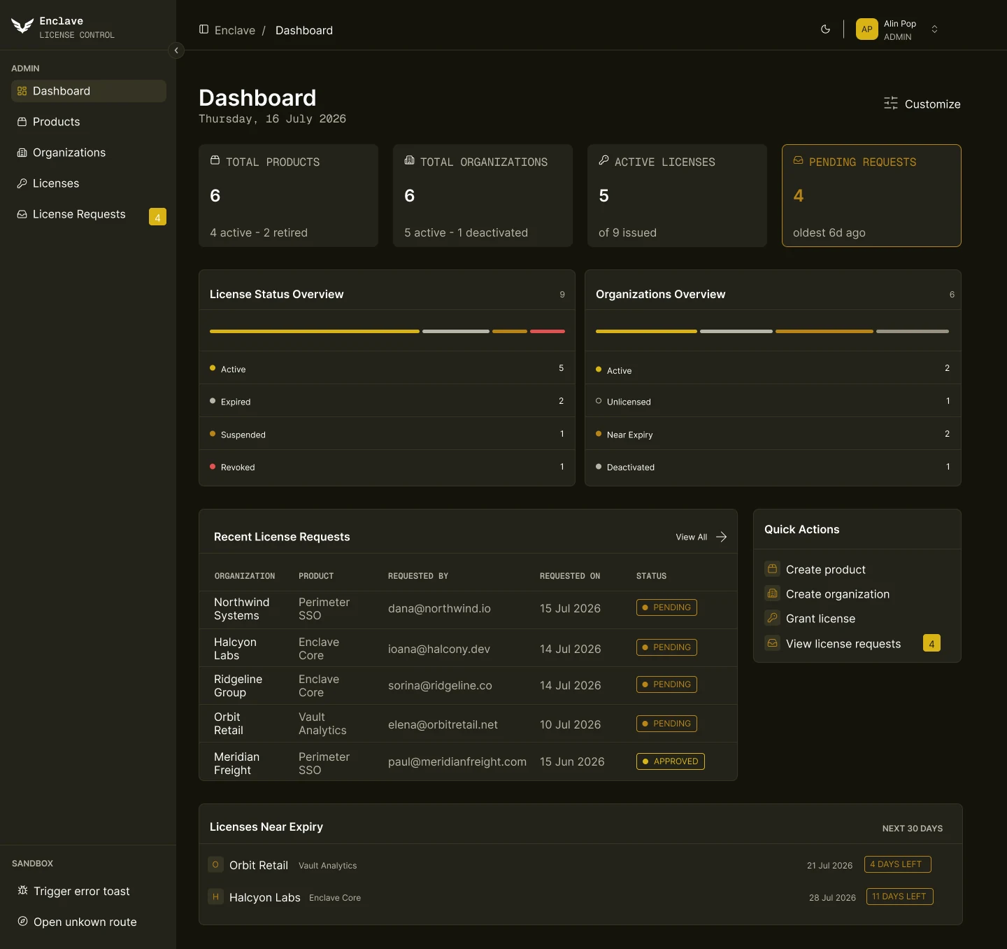
Every color in Enclave is a variable with a light and a dark value, so the whole interface switches theme without redesigning a single screen. The prototype covers the everyday actions too, from switching themes and searching to editing, approving and revoking.
Light & dark themes
Colors, surfaces and status labels all come from one set of variables, switched between light and dark.
Editable product cards
Products are created and edited in focused pop-ups, where each field switches to its editing state on click.
Actions in place
A “More” menu on each product opens its actions right where you are, with a confirmation before anything is deleted.
Search & filters
Search narrows the table as you type, and status filters toggle on and off with a click.
Feedback after actions
Saving, deleting, approving or revoking shows a short confirmation that closes on its own.
A guided start
The prototype opens on a short guide to the interactions worth trying, each one a click away.
Key decisions
The choices that shaped the final interface.
Status at a glance
Licenses and requests use consistent status labels — such as Active, Pending or Revoked — so their state can be read without opening each item.
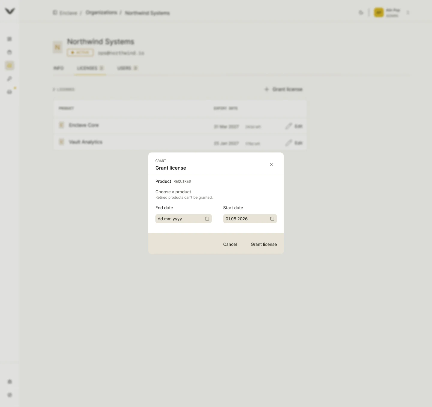
Focused actions in dialogs
Granting a license or reviewing a request happens in a compact dialog over the current page, so the context is never lost.
A dashboard that points to what’s next
The dashboard pairs overview cards with recent requests and quick actions, so it works as a starting point, not just a report.
Final UI
A calm, neutral interface where typography and spacing do most of the work, keeping the focus on content and the most important actions.
What I’d do next
Where I would take the project next.
Test with license admins
Watch how admins handle requests and renewals, and simplify the steps that slow them down.
A first-time experience
Empty states and a short onboarding for a new organization with no products yet.
Accessibility pass
Keyboard navigation through tables and dialogs, and contrast checks in both themes.