Client project · Web Dashboard
Mietfluss
Property Management Dashboard · UI/UX Design
Live website — coming soon
Overview
A UI/UX design project for a digital property management platform, created in remote collaboration with a Vienna-based team, focused on simplifying rental and transaction management from tenancies and payments to rules that keep transactions organized.
My approach
Mietfluss handles a lot of numbers, so I focused on making them easy to read and act on. I kept the navigation compact, organized transactions into clear tabs, and let well-structured tables carry most of the information.
Product structure
The product is organized into seven areas, from signing in to connecting a bank account. Each one has a clear place in the navigation.
Authentication
Sign in, sign up and account recovery.
Dashboard
An overview of tenancies, recent transactions and open items.
Tenancies
Properties, tenants and rental agreements in one list.
Transactions
Incoming and outgoing payments, searchable and filterable.
Transaction Rules
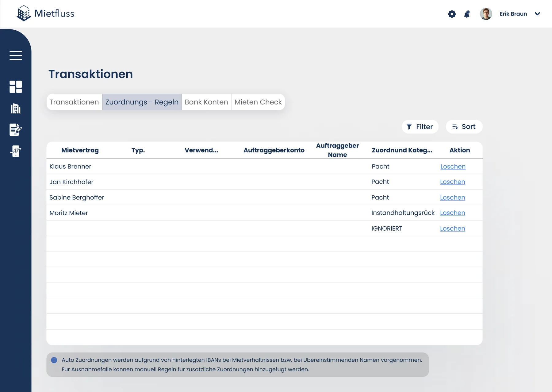
Rules that sort recurring transactions into categories.
Bank Account Integration
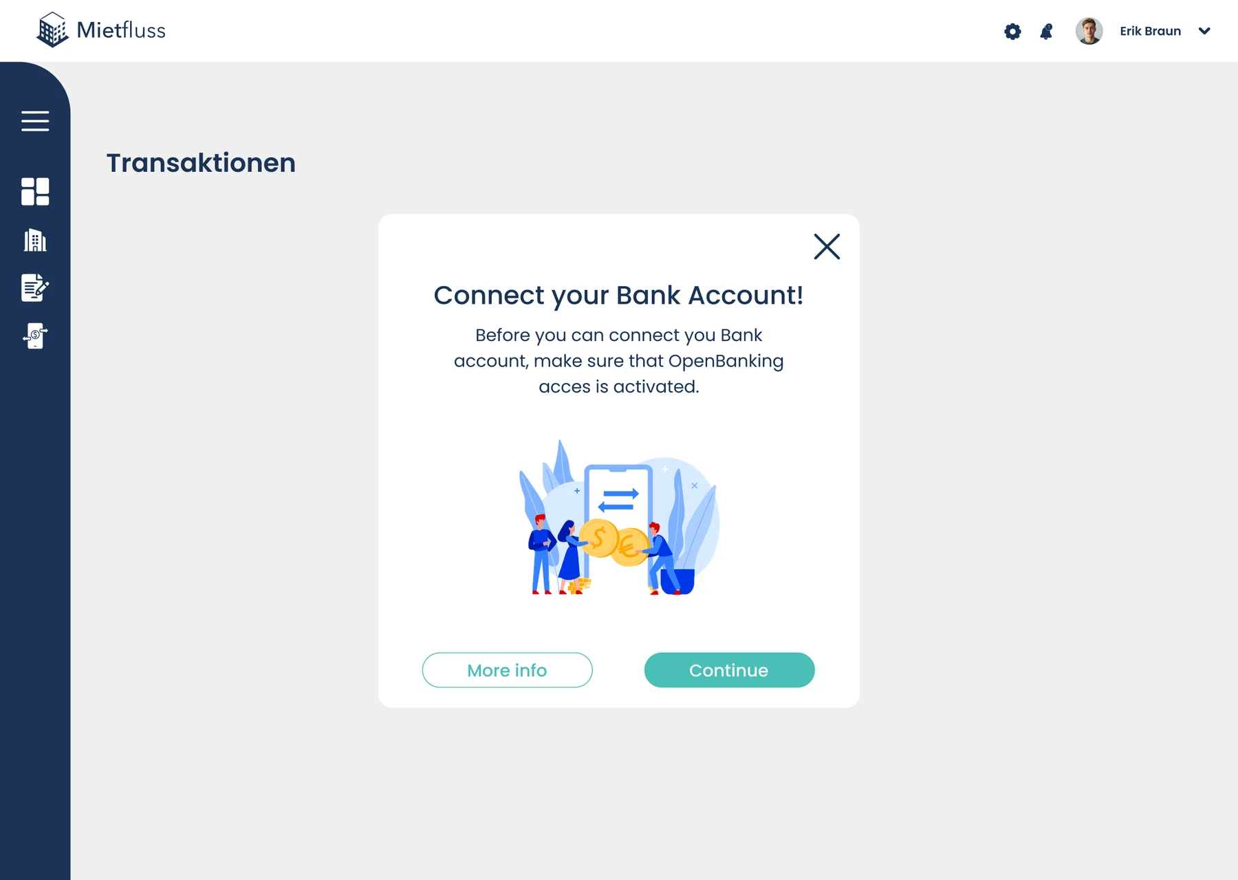
Connecting a bank account to import transactions.
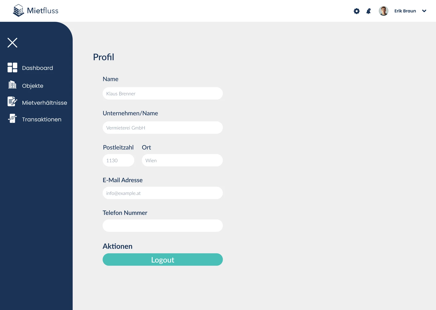
Profile & Settings
Personal details, preferences and security.
Dashboard
The dashboard gives a quick overview of what needs attention tenancies, recent transactions and open items with the most important information placed first.
Data-heavy interfaces
Tables and lists are designed for scanning: aligned columns, clear status labels, and filters and sorting kept close to the data, so amounts and payment states stay easy to read.
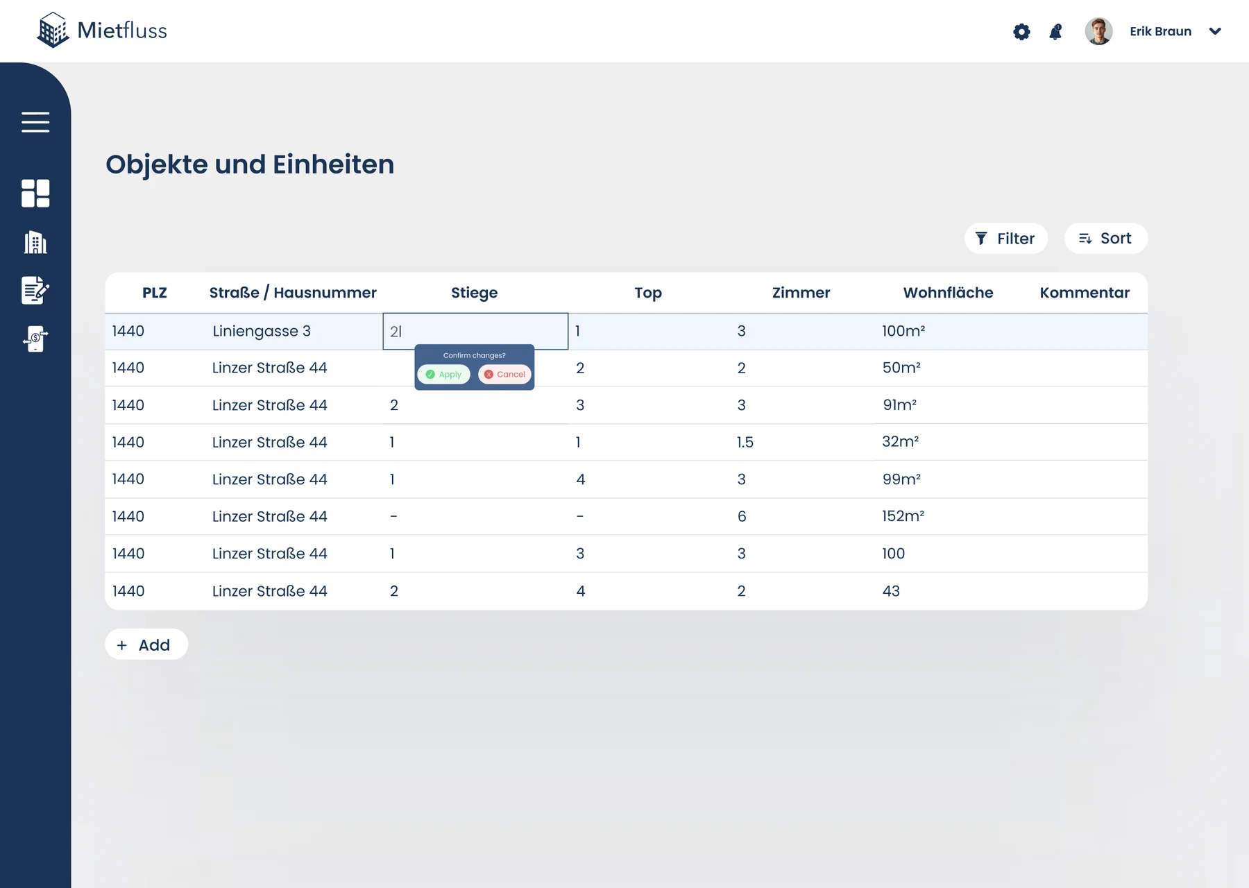
04Tenancies
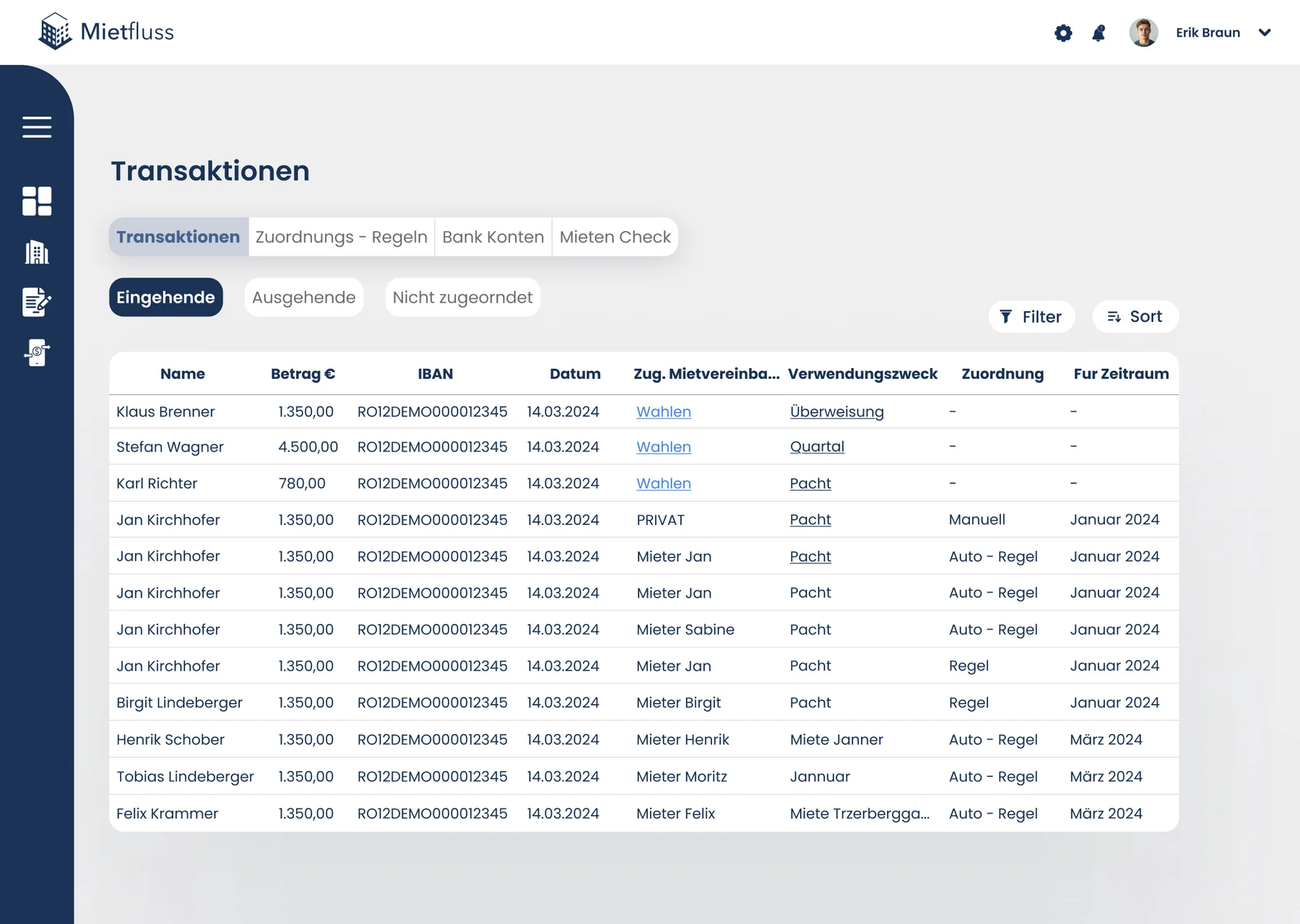
05Transactions
Key interactions
The interactions that shape everyday use of the platform.
Creating a transaction rule
Define conditions and a category once; matching transactions are sorted automatically.
Connecting a bank account
A short, step-by-step flow with clear progress and a confirmation at the end.
Filtering and searching
Filters stay visible above each table, so the current view is always clear.
Signing in
A focused authentication flow with clear error and recovery states.
Key decisions
The choices that shaped the final interface.
Related tasks grouped in tabs
Transactions, assignment rules, bank accounts and rent checks live in one area under tabs, so related work stays together.
Assign once, then automate
When assigning a transaction, it can be saved as a rule for the future, turning a repeated manual task into a single choice.
A guided bank connection
Connecting a bank account starts with a short explanation before continuing, so an unfamiliar step feels clear.
Final UI
A clean, structured interface with a dark navigation rail and consistent tables and forms carried through bank account connection, transaction rules and profile settings.
What I’d do next
Where I would take the project next.
Test with property managers
See how they reconcile payments: where tables and rules save time, and where they still get stuck.
A mobile view for quick checks
A compact view for checking open items and recent payments on the go.
Edge cases
Failed bank syncs, partial payments and duplicate transactions, the states a data-heavy tool has to handle gracefully.