Concept project · Landing Page
Subsonic
Music Festival Landing Page · Visual Design

Overview
A self-initiated concept for SUBSONIC, a fictional open-air electronic music festival. After three calm, refined projects, I wanted to prove range: a brand that is loud and playful, but still clear and usable.
The challenge
Festival pages are mostly opened on the go, from a social link. The page had to grab attention in the first scroll, while dates, lineup and ticket prices stayed instantly readable in the middle of all the noise.
Visual direction
Neo-brutalism with a rave poster attitude: saturated colors, thick borders, hard shadows and type set big enough to feel physical.
Acid Lime
#C6FF1A — primary background, pure energy.
Ink
#0B0B0B — type, borders and hard shadows.
Signal Orange
#FF5A1F — calls to action and highlights.
Ultra Violet
#7B5CFF — stickers and accents.
Unbounded Black
Display type, set tight at 82% line height.
Space Grotesk
Body copy that stays readable at any size.
Space Mono
Labels, meta info and navigation.
Hard shadows
0 blur, 8px offset, 3px borders on everything.
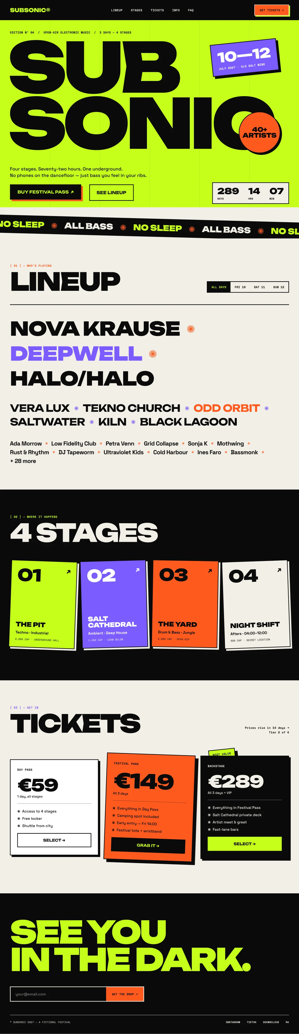
Full landing page
Hero, lineup, stages, tickets and footer, on desktop and mobile. Each section gets its own color moment, while one grid and one set of rules keep the page consistent.

Motion & interactions
Small moments that make the page feel alive, planned for the prototype.
Endless marquee
The “NO SLEEP ✺ ALL BASS” band scrolls non-stop and speeds up with the page scroll.
Sticker drop-in
Date and artist stickers fall into place on load, with a little bounce and rotation.
Tilting stage cards
Stage cards straighten and lift on hover, their hard shadow growing with them.
Live countdown
A ticking countdown to opening day keeps the urgency right in the hero.
Key decisions
How the page stays usable while it shouts.
Chaos on a grid
Every rotated sticker and card sits on a six-column grid, shown as faint lines in the hero, so the noise always feels intentional.
The important parts stay calm
Tickets keep a clear hierarchy: price, what’s included, one action. Only the featured tier breaks the grid.
Contrast where it counts
Dates, prices and CTAs always use the strongest pairs, ink on lime and lime on ink, so the key information is never lost.
What I’d do next
Where I would take the project next.
Build the motion
Prototype the marquee, sticker drops and countdown in code, and check they stay smooth on mid-range phones.
A reduced-motion version
A calmer version of the page for people who have reduced motion turned on.
Ticket checkout
A short purchase flow that keeps the energy, but stays calm where money is involved.