Personal project · Mobile App
ResQ
Pet Adoption & Care App


Overview
ResQ is a concept mobile app designed to make pet adoption and everyday pet care more accessible and organized. It brings together pet discovery, adoption, veterinary appointments, conversations, favorites, donations, volunteering and local pet resources in one place.
My approach
I wanted the experience to feel approachable and calm, especially because adoption can already be an emotional process. I focused on keeping the main actions visible and making the journey from discovering a pet to scheduling a visit feel straightforward.
Challenge
Adopting and caring for a pet involves many separate steps finding the right animal, contacting a shelter, booking a visit and keeping track of appointments. The goal was to bring these moments into one calm, organized experience without making the app feel crowded.
Concept
The app is built around a home screen for discovering pets, with clear paths into adoption, care and community. Each pet profile connects directly to the next step: expressing adoption intent, scheduling a visit or saving the pet to favorites.
Pet discovery
Adoption
Vet appointments
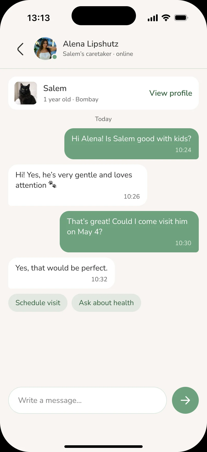
Conversations
Favorites
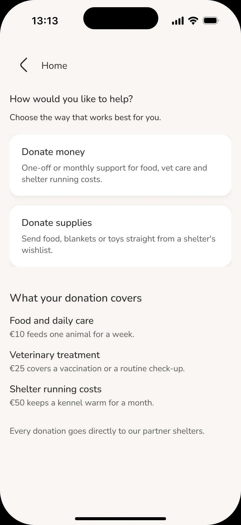
Donations
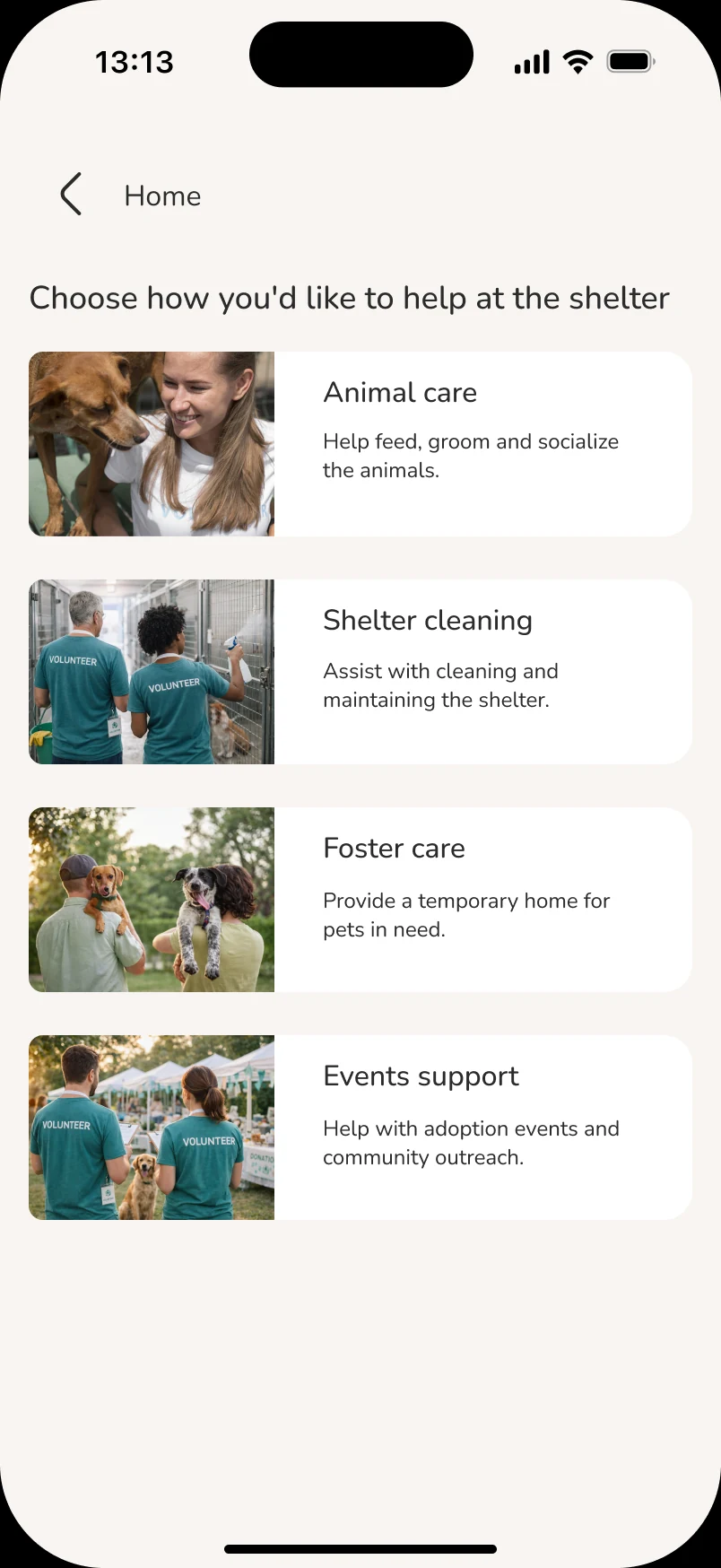
Volunteering
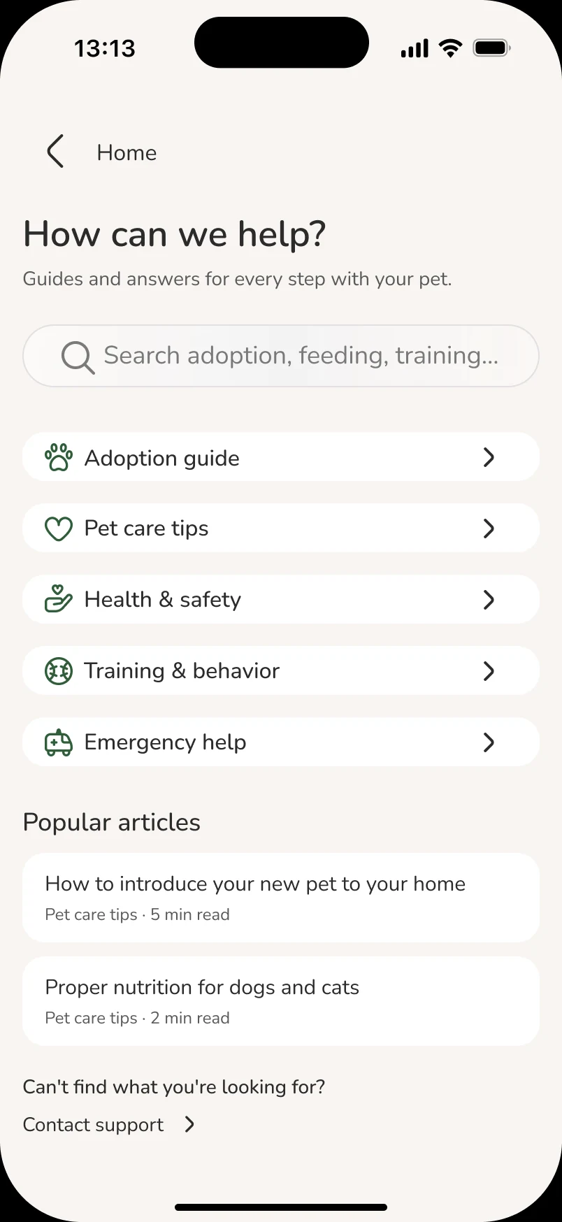
Local resources
Visual direction
Warm and calm, so a sensitive topic like adoption feels friendly: soft neutrals, one green for every action, rounded shapes and gentle illustrations for the moments in between.
Green
#6EA27E — buttons, chips and every primary action.
Deep Green
#2F5D3A — icons, links and emphasis.
Warm White
#F8F5F2 — backgrounds, with white cards on top.
Heart
#E36A5D — favorites and small warm accents.
Nunito
One rounded typeface for everything, in three weights.
Soft corners
Three radii only: 8 for small items, 16 for cards, pill for buttons and chips.
 03
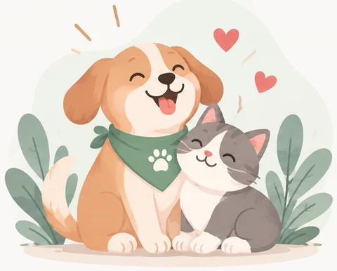
03Illustrations
Soft watercolor scenes for empty states and confirmations.
Line icons
One outline style, one size and one color across the app.
User Flow
The main adoption path, from discovering a pet to a confirmed shelter visit. Favorites act as a side path, so users can save pets and return to them later.
Key Screens
Six screens that carry the core adoption journey from browsing pets to confirming a visit and keeping track of favorites.
01Home - feed
02Pet profile - Salem
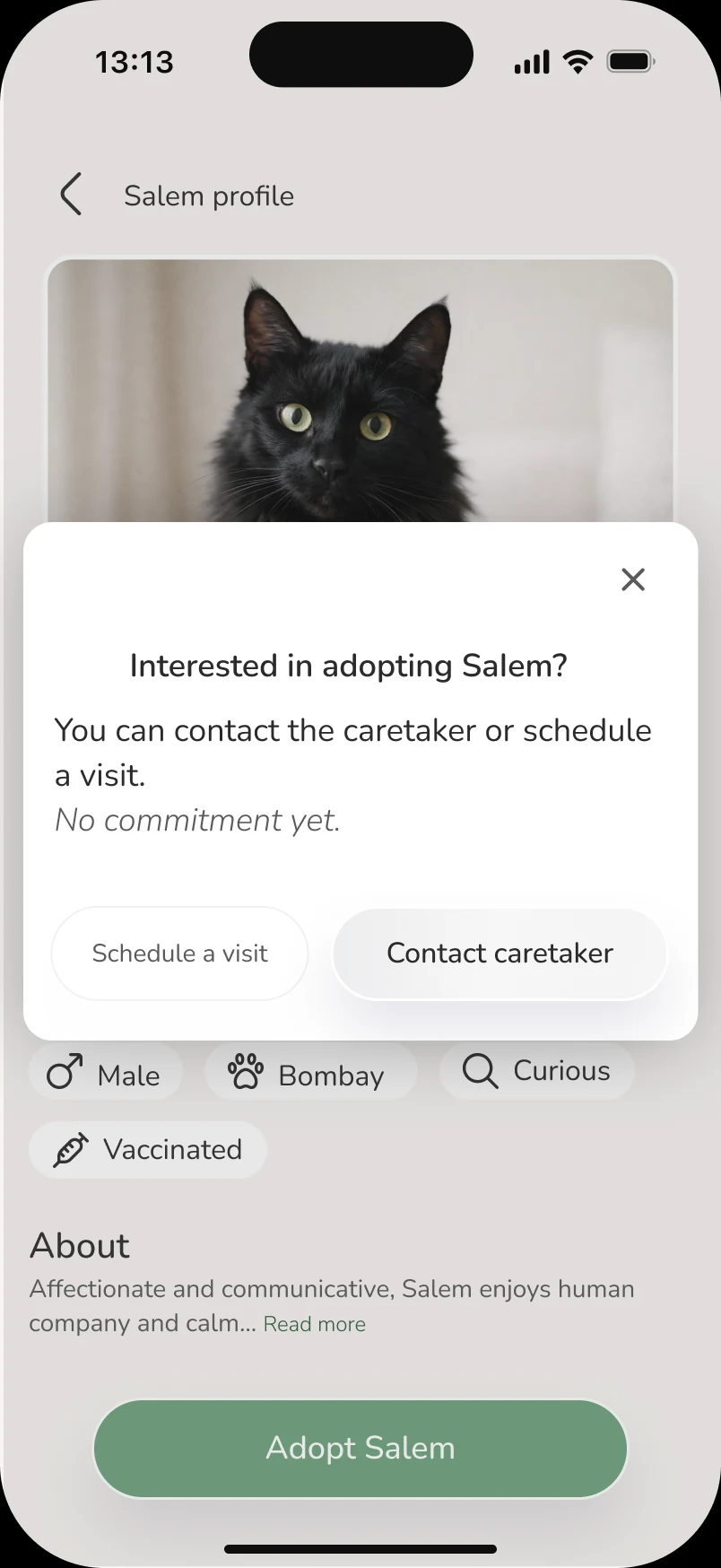
03Adoption intent
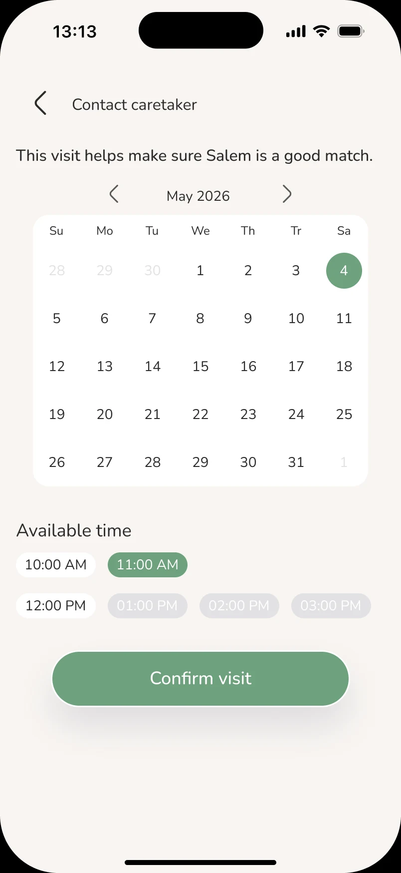
04Schedule visit
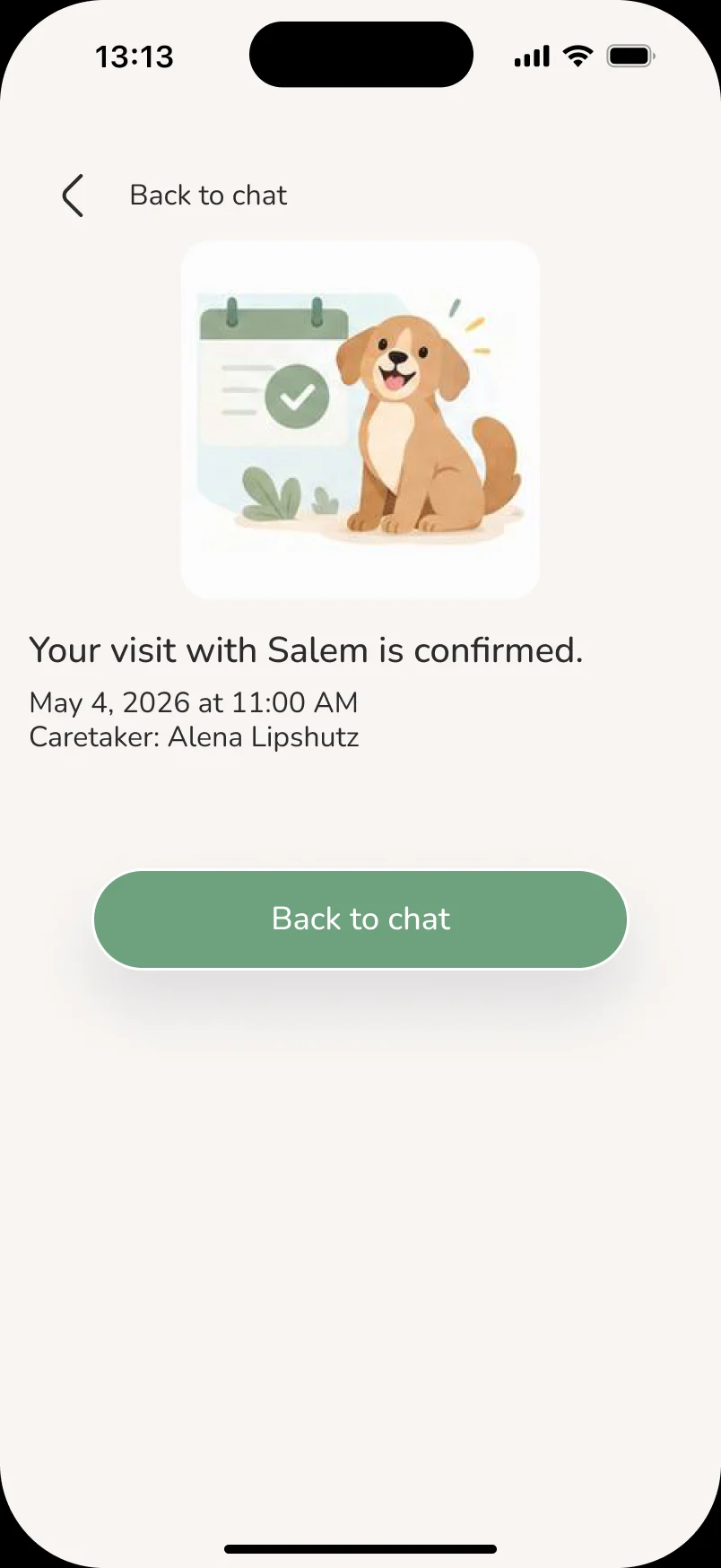
05Visit confirmed
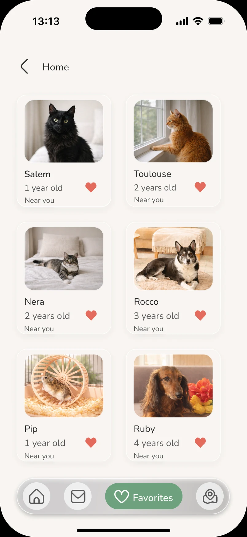
06Favorites
Interactive prototype
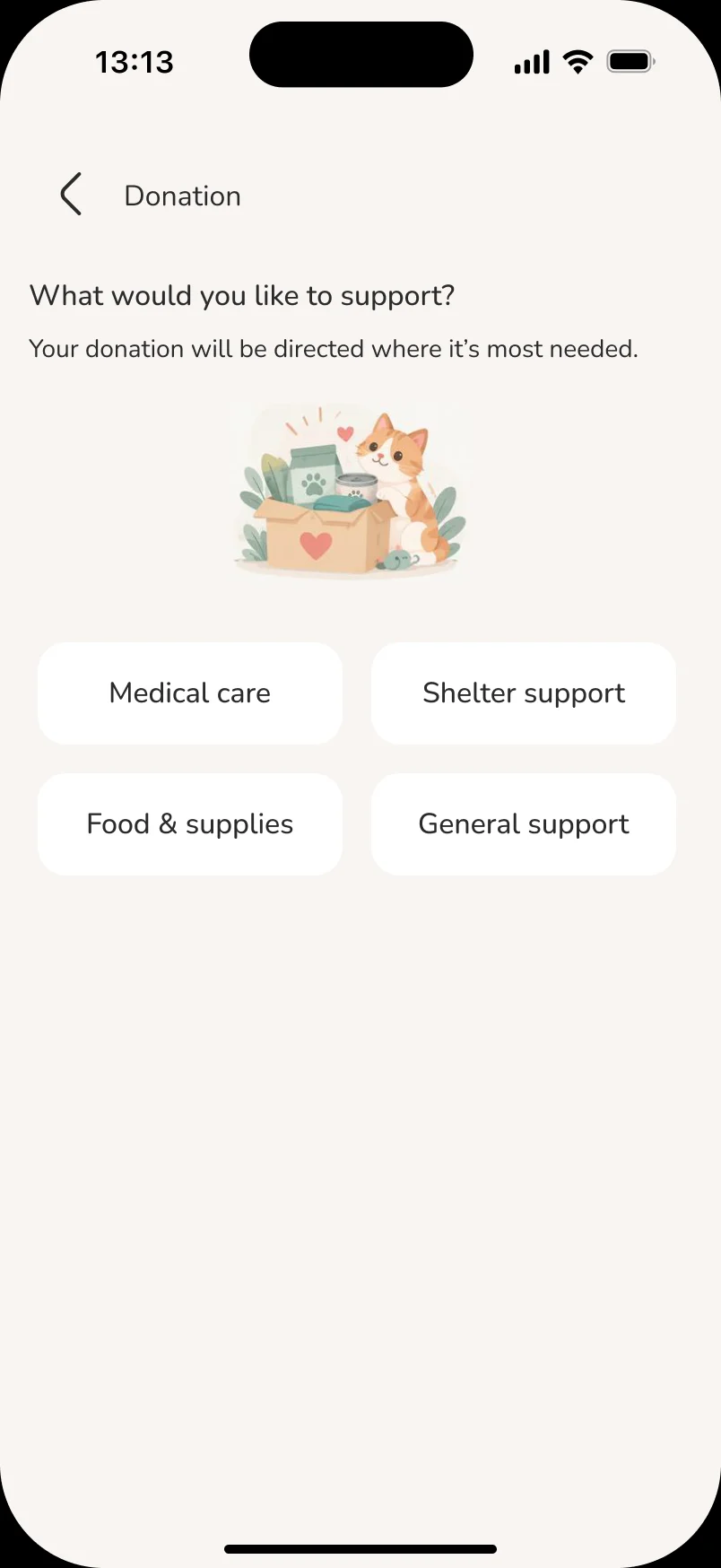
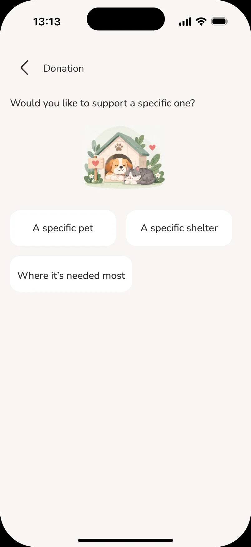
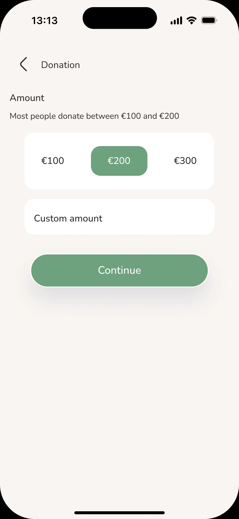
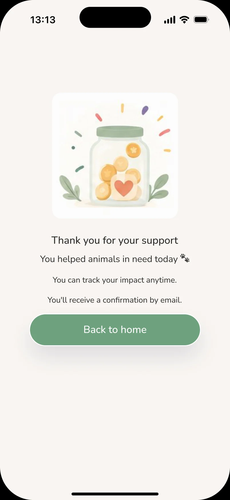
A clickable Figma prototype connects the main flows end to end. Shown here: the donation flow, from choosing how to help to the thank-you screen.
Key decisions
The choices that shaped the final interface.
One clear next step
Pet profiles, adoption and visit screens each lead with a single primary button — like “Adopt Salem” or “Confirm visit” — so the next step is never ambiguous.
Low-pressure adoption intent
Showing interest opens a light prompt to contact the caretaker or schedule a visit, with no commitment yet, instead of a long form.
Everything one tap away
Home, messages and favorites stay in a persistent bottom bar, so browsing and following up on a pet feel like one connected experience.
Final UI
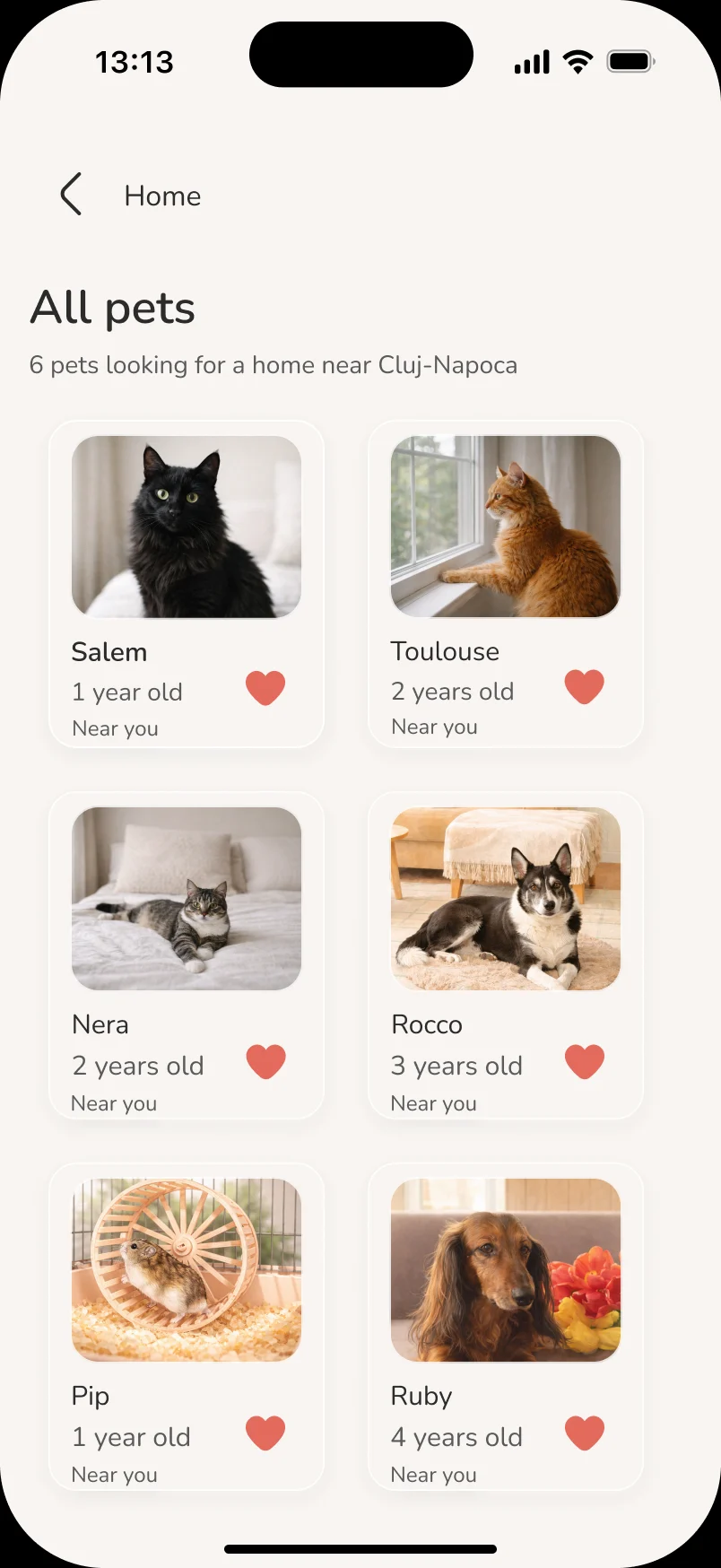
A warm, quiet interface with clear hierarchy, generous spacing and large pet imagery carried across discovery, messages, volunteering and the help center.
What I’d do next
Where I would take the project next.
Test the adoption flow
Run usability sessions with people who are looking to adopt, from browsing pets to a confirmed shelter visit.
Design the shelter side
A view for shelters to manage pet listings, visit requests and conversations with adopters.
Accessibility pass
Check contrast, touch target sizes and screen-reader labels across every screen.